Bluff Europe was the world’s leading poker magazine, and I was responsible for designing its visual identity and layout.
Working closely with the editorial team, I distilled the content to create an engaging and immersive reading experience that captured the energy and drama of the poker world.
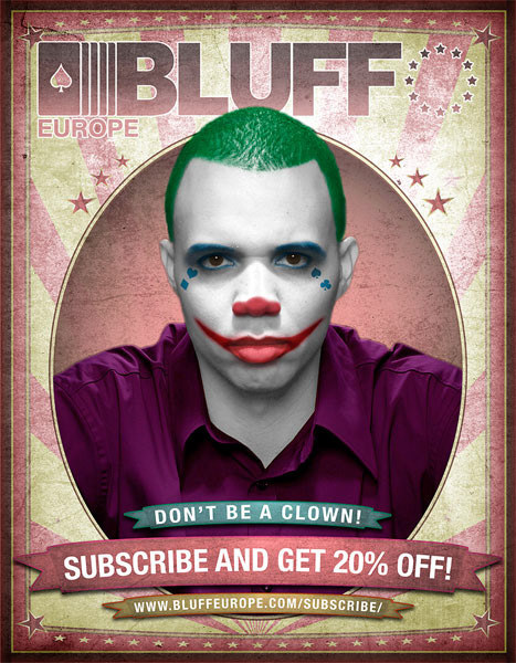
While the magazine did incorporate traditional poker imagery and darker, moodier tones to reflect the intensity of the game, I brought a fresh approach by carefully balancing these elements with clean layouts, bold typography, and dynamic pacing. This helped modernise the aesthetic while staying true to the culture and expectations of the audience.
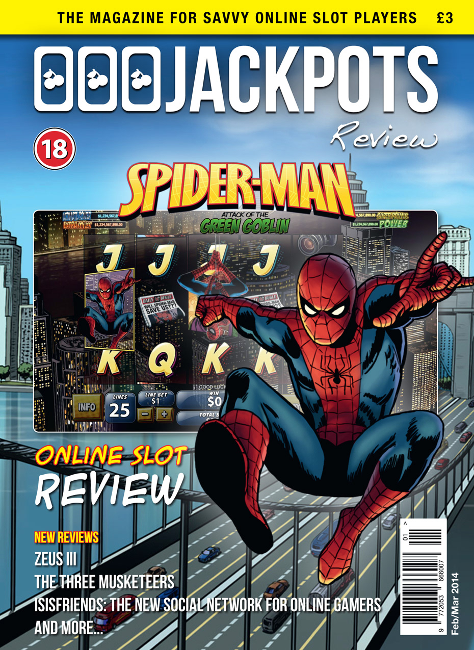
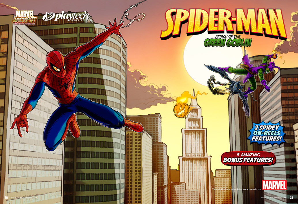
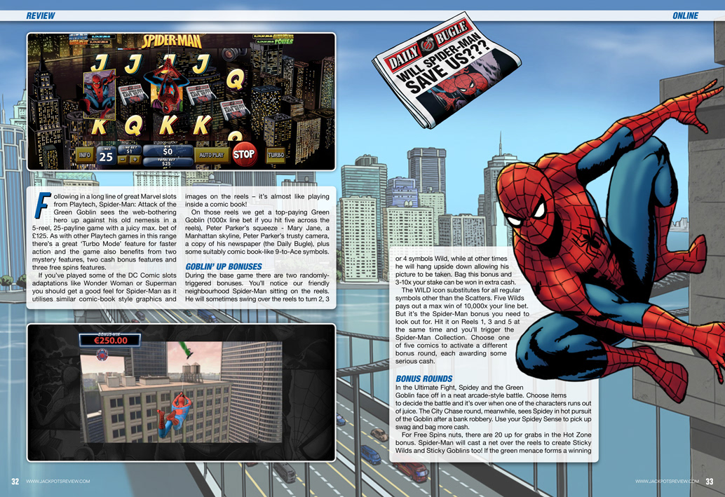
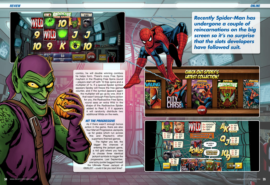
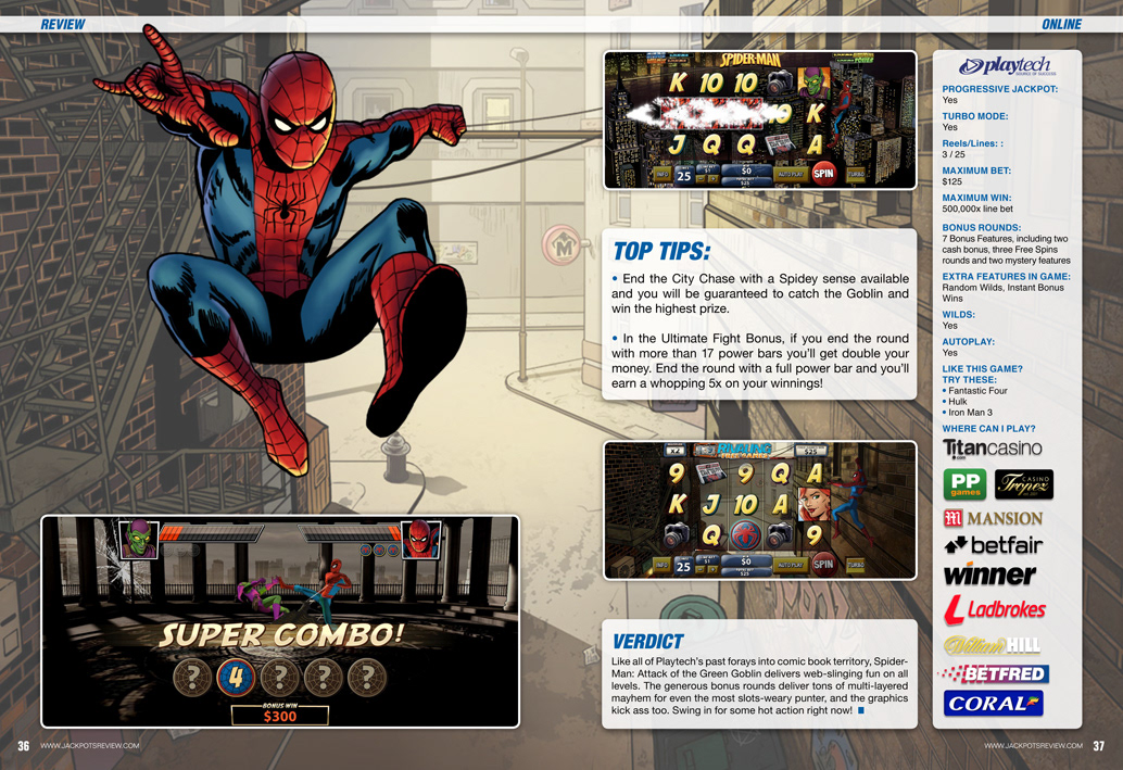
I also designed Jackpots Review, a slot games magazine that featured reviews and promotional content. For one edition, I used assets such as Marvel’s Spider-Man to build a narrative within the review, transforming it from a standard product overview into a story-driven experience. This approach added depth and visual interest, making the content more memorable and engaging for readers.
Across both publications, my goal was to elevate the visual storytelling while maintaining brand consistency and reader appeal, resulting in designs that were both impactful and well-received.