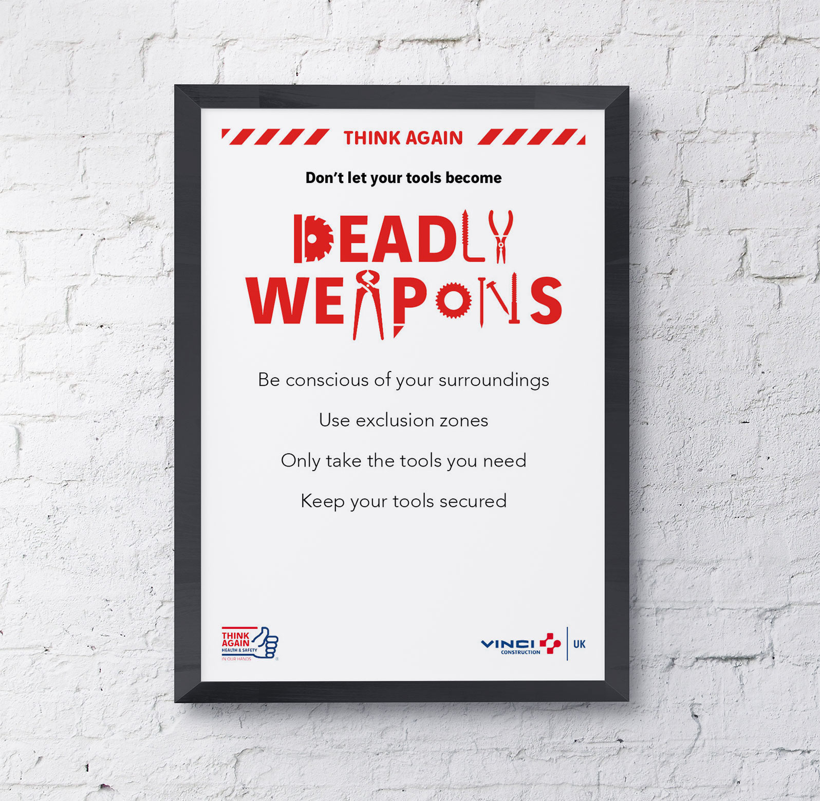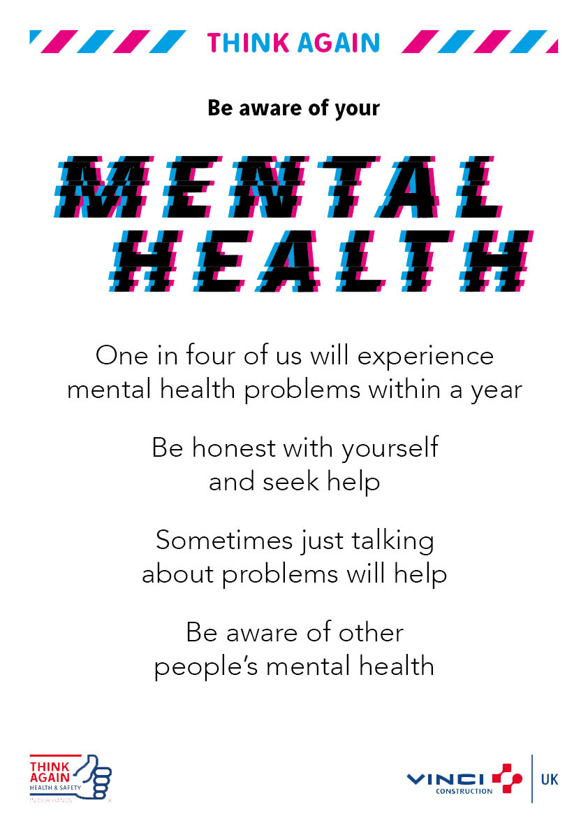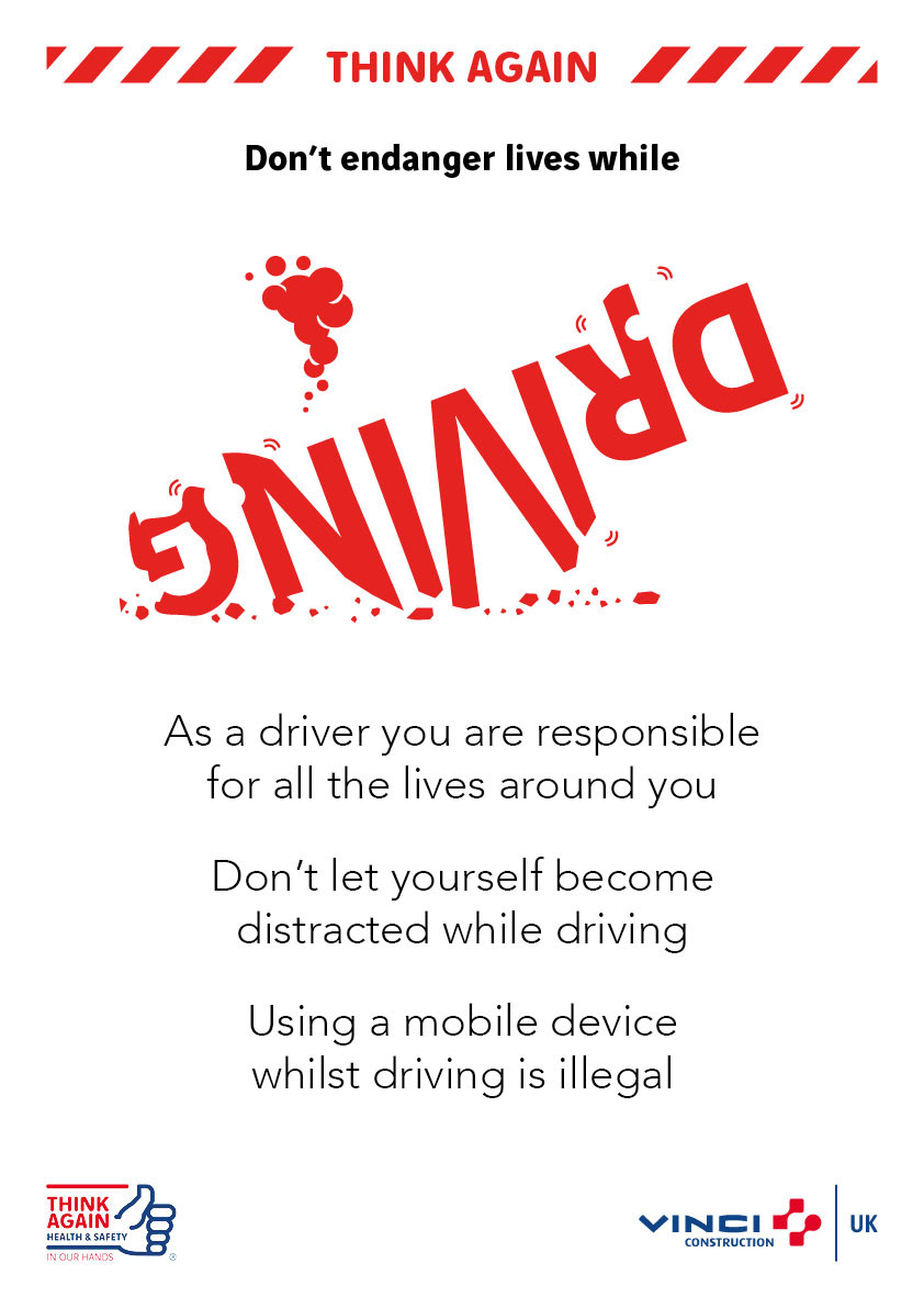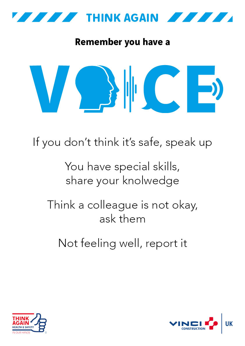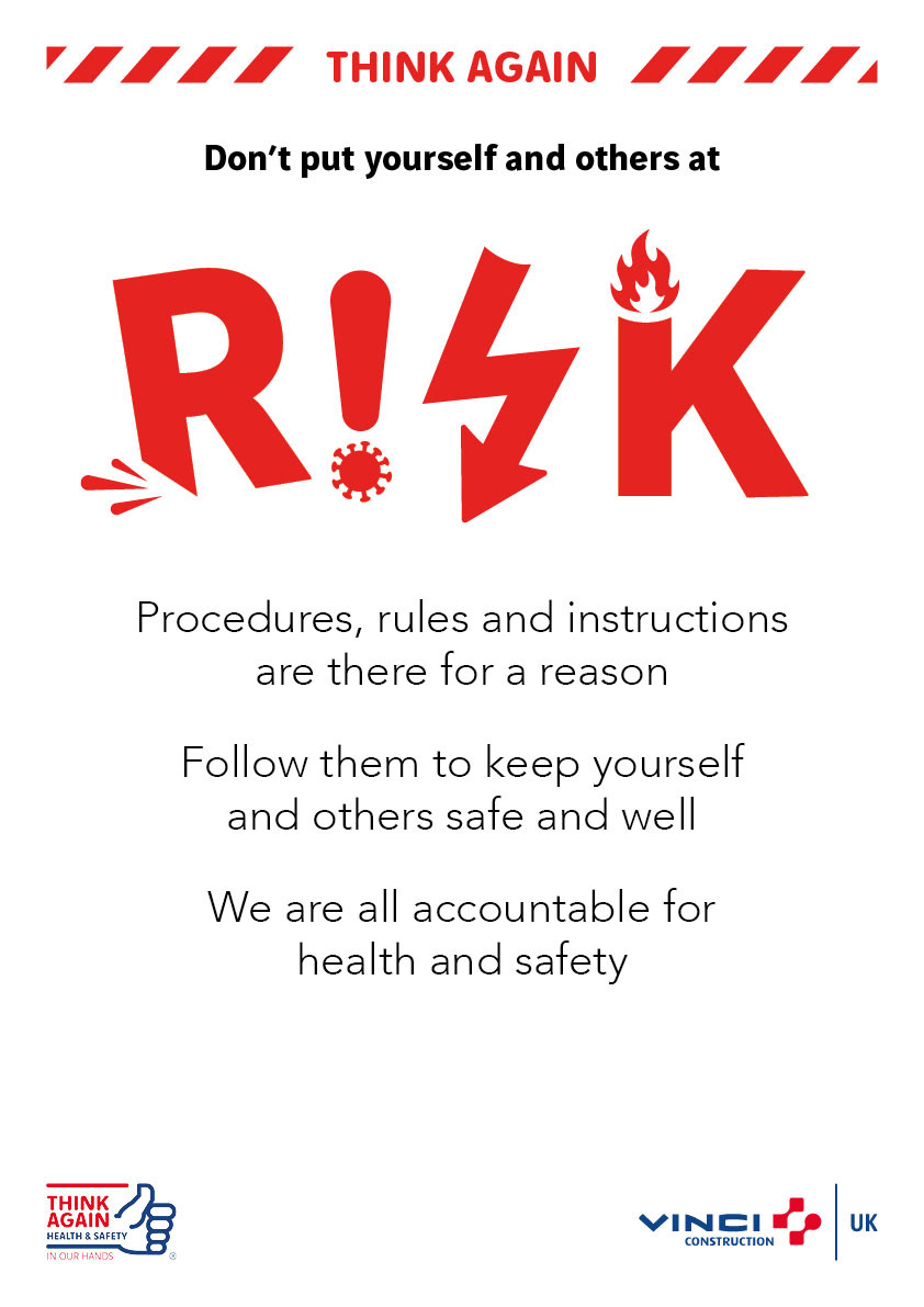
These posters were part of the Think Again campaign, designed to deliver health and safety messages to staff across both office and construction sites.
To capture attention, I used a clean white background paired with creatively styled titles. Each poster features a bespoke title design that incorporates imagery related to the subject matter, helping to visually reinforce the message.
A bold font was used for the opening line of text to further draw the viewer in. Positioned between the coloured header and the title, the font’s weight adds emphasis and clarity.
The colour palette for each poster was carefully chosen to reflect the specific topic being addressed.
To signal the seriousness of the content, I added hazard tape graphics on either side of the Think Again logo. Against the white background, these elements stand out and help attract the attention of passers-by.