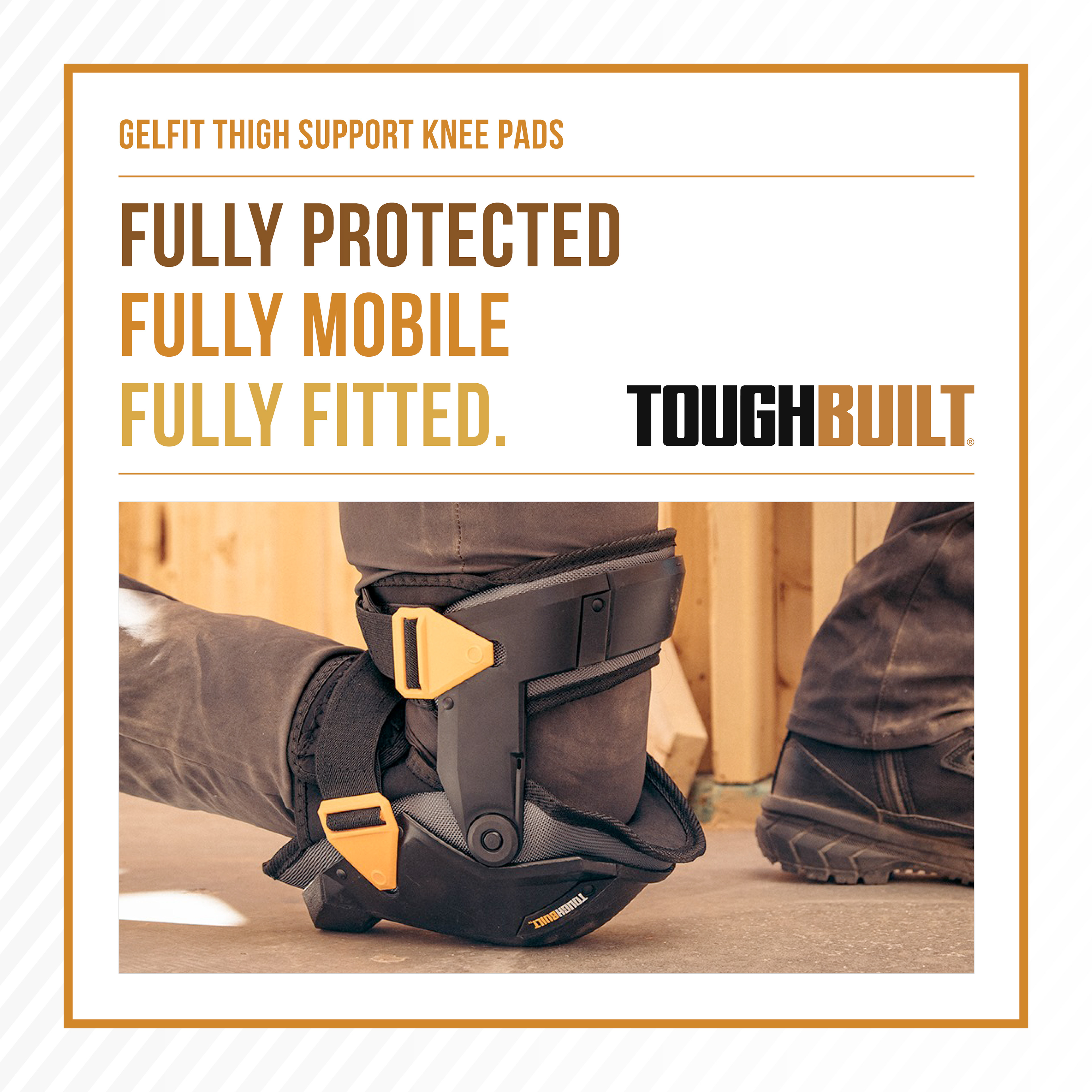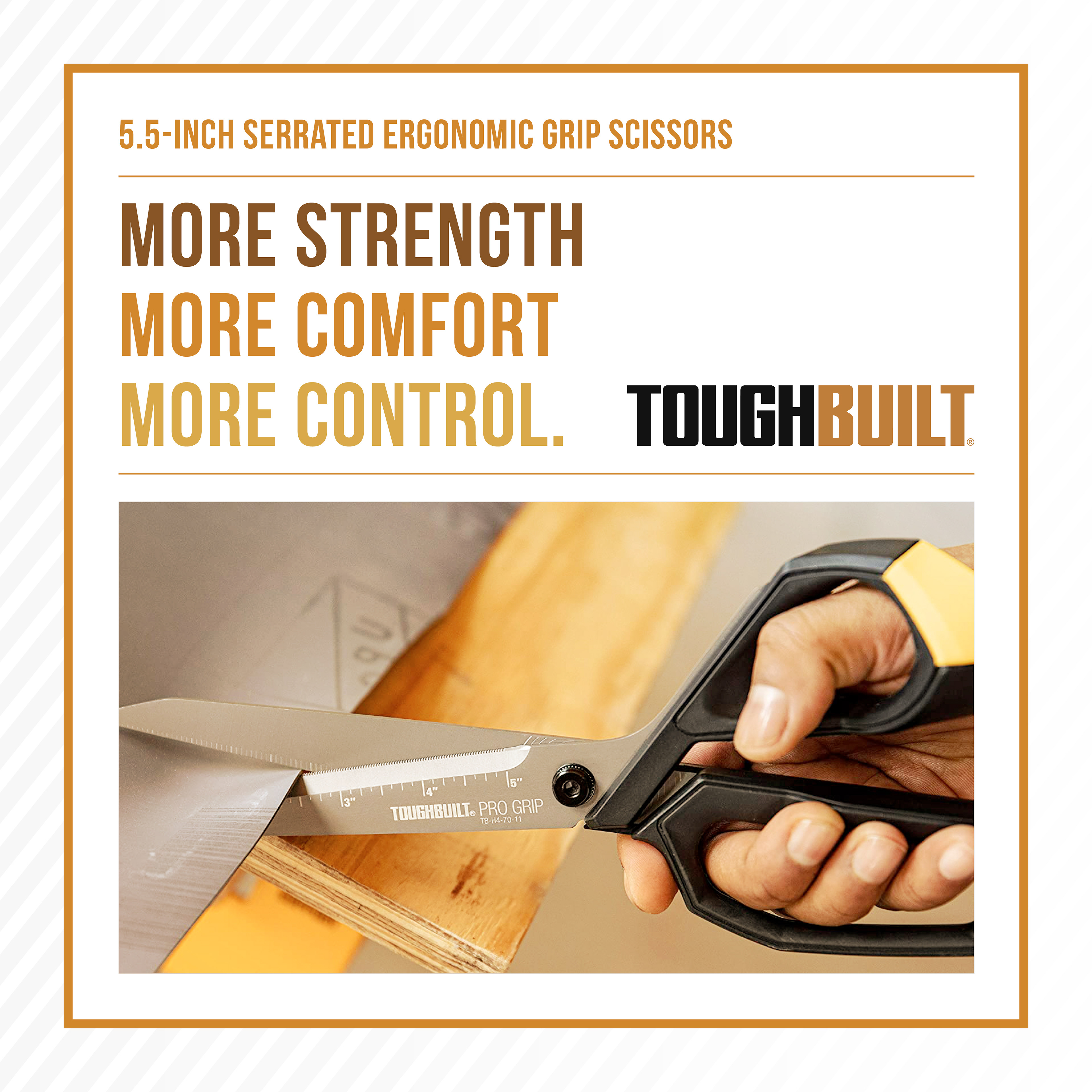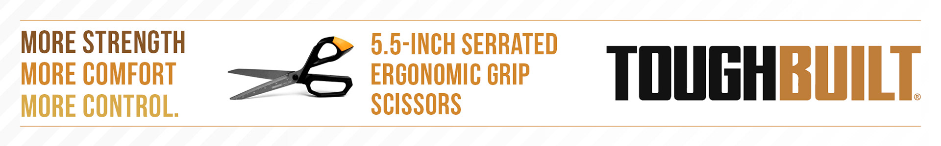

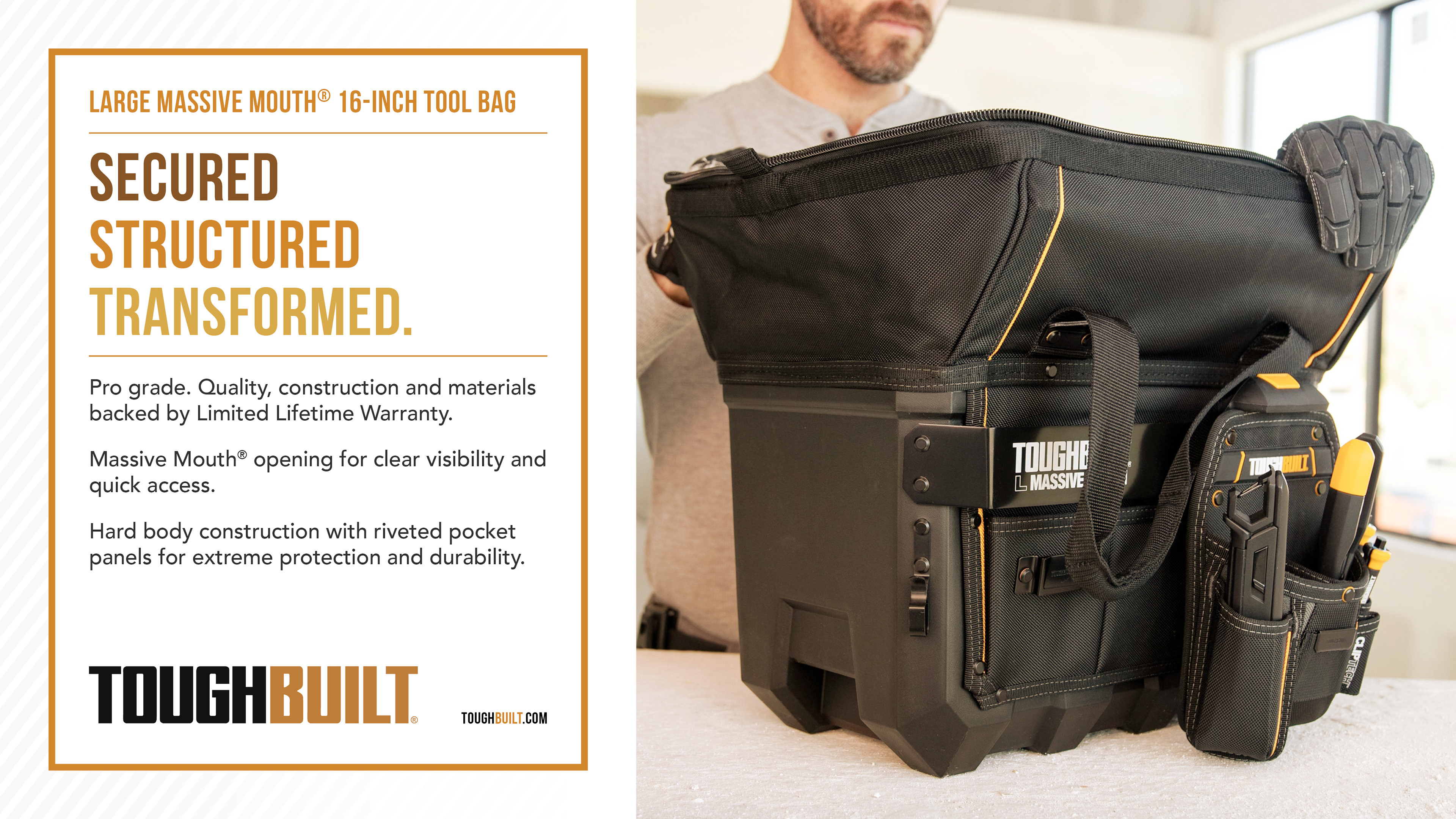
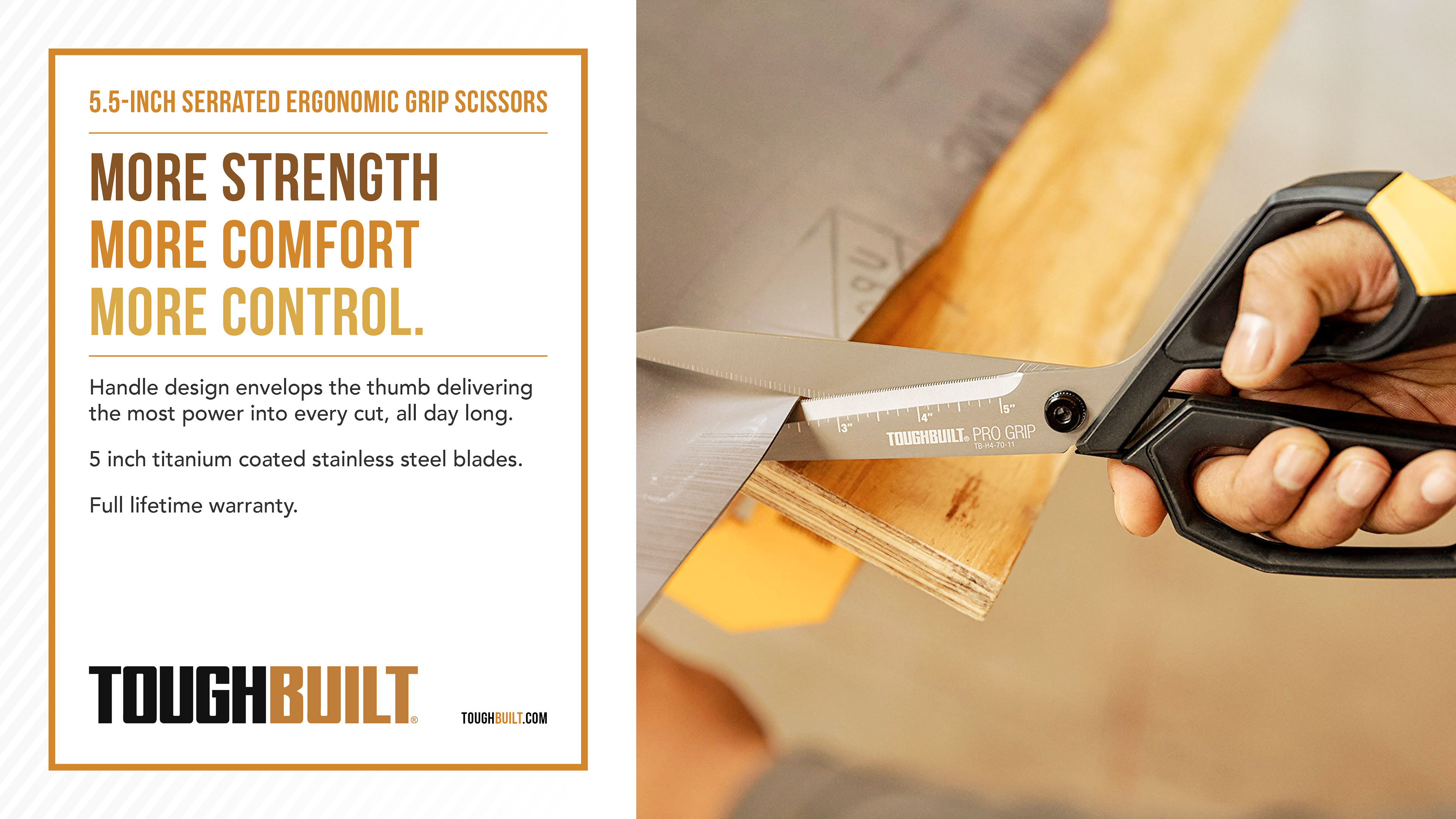
After thoroughly researching the ToughBuilt brand, I developed a refreshed visual identity to promote their products, one that honoured their existing branding while introducing a more engaging and contemporary aesthetic.
ToughBuilt’s core brand colours, black and orange, are bold and industrial, so I complemented them with a harmonious palette of brown, orange, and yellow. This combination added warmth and depth to the visuals while ensuring the ToughBuilt logo remained prominent and instantly recognisable.
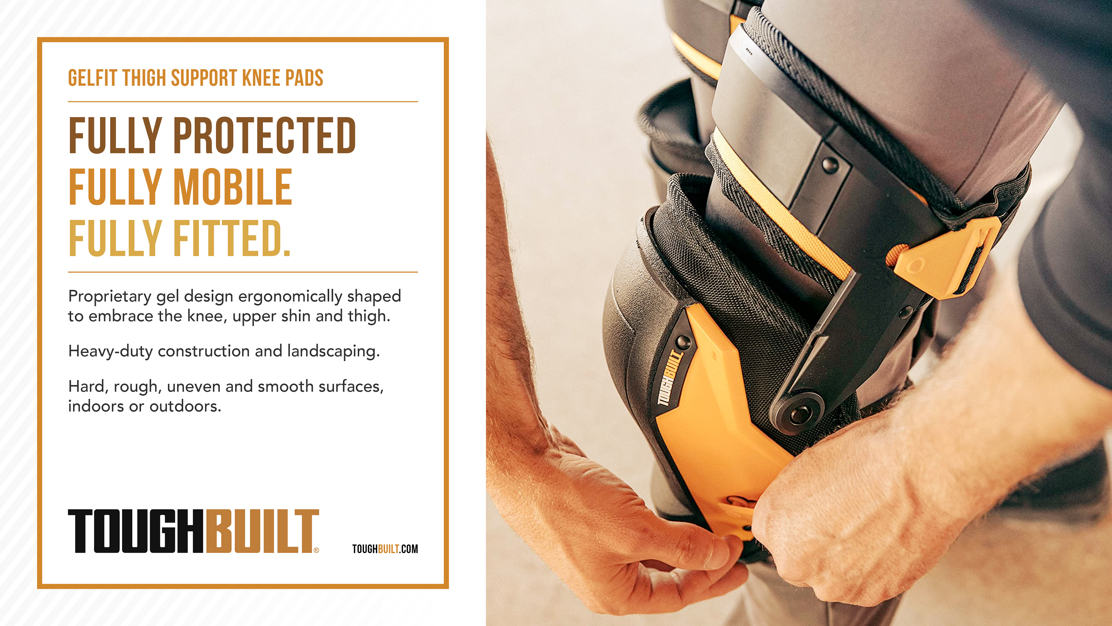
For each product, I crafted three concise lines of text that distilled its core purpose and benefits, designed to inform the viewer instantly and clearly. These lines were styled to draw attention, using a simple layout that allowed the messaging to stand out without distraction.
To centralise the focal point, I introduced a thin orange frame that subtly guides the viewer’s eye toward the product and its messaging. Behind this, I created a lined background that fades into the corners, reminiscent of carbon fibre, a material known for its strength and safety. This texture added depth and reinforced the brand’s association with durability and reliability.
The result is a clean, impactful design system that feels fresh while staying true to ToughBuilt’s rugged and professional identity. It’s a balance of clarity, brand integrity, and visual appeal, tailored to resonate with both existing customers and new audiences.
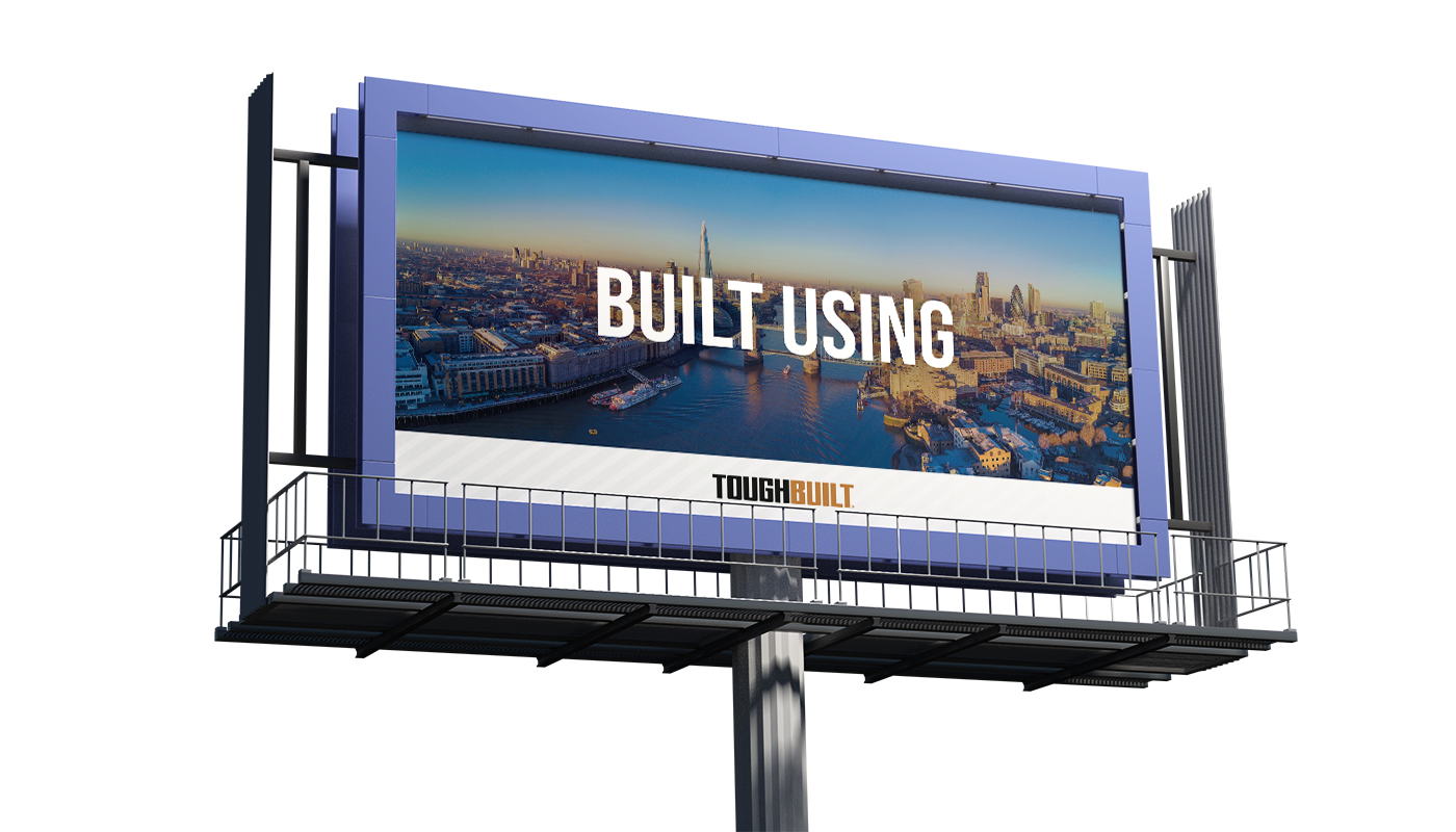
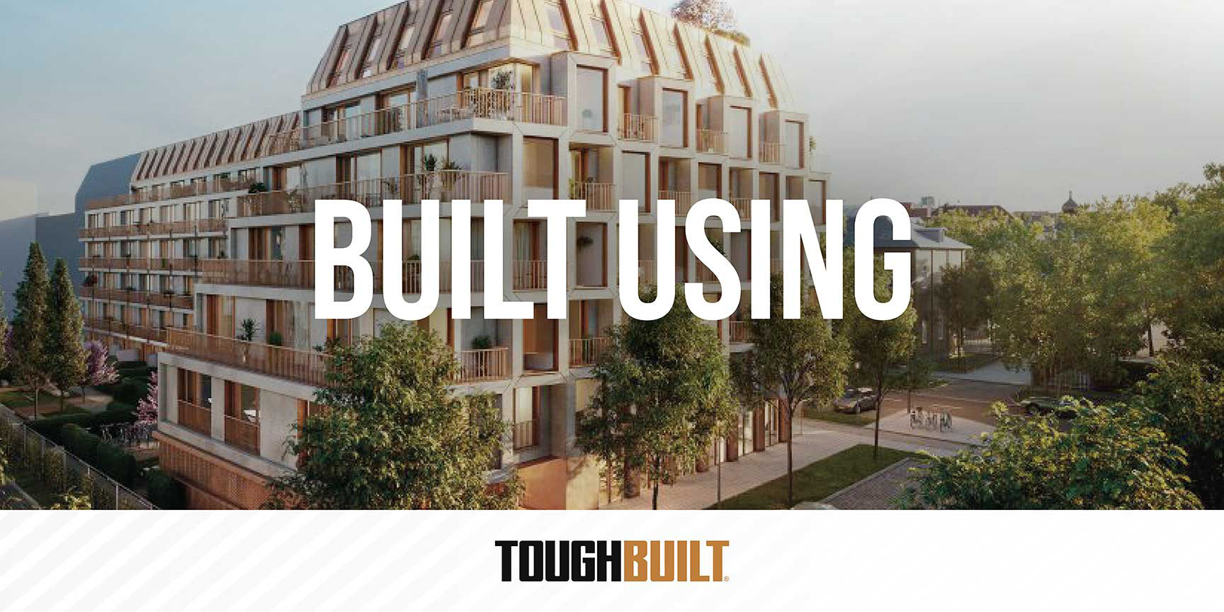
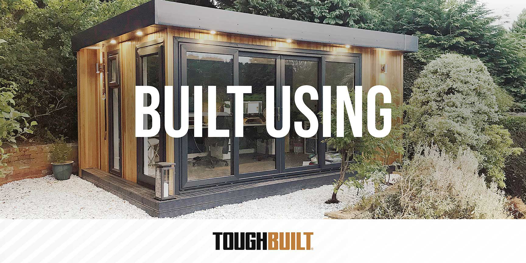
Billboard designs

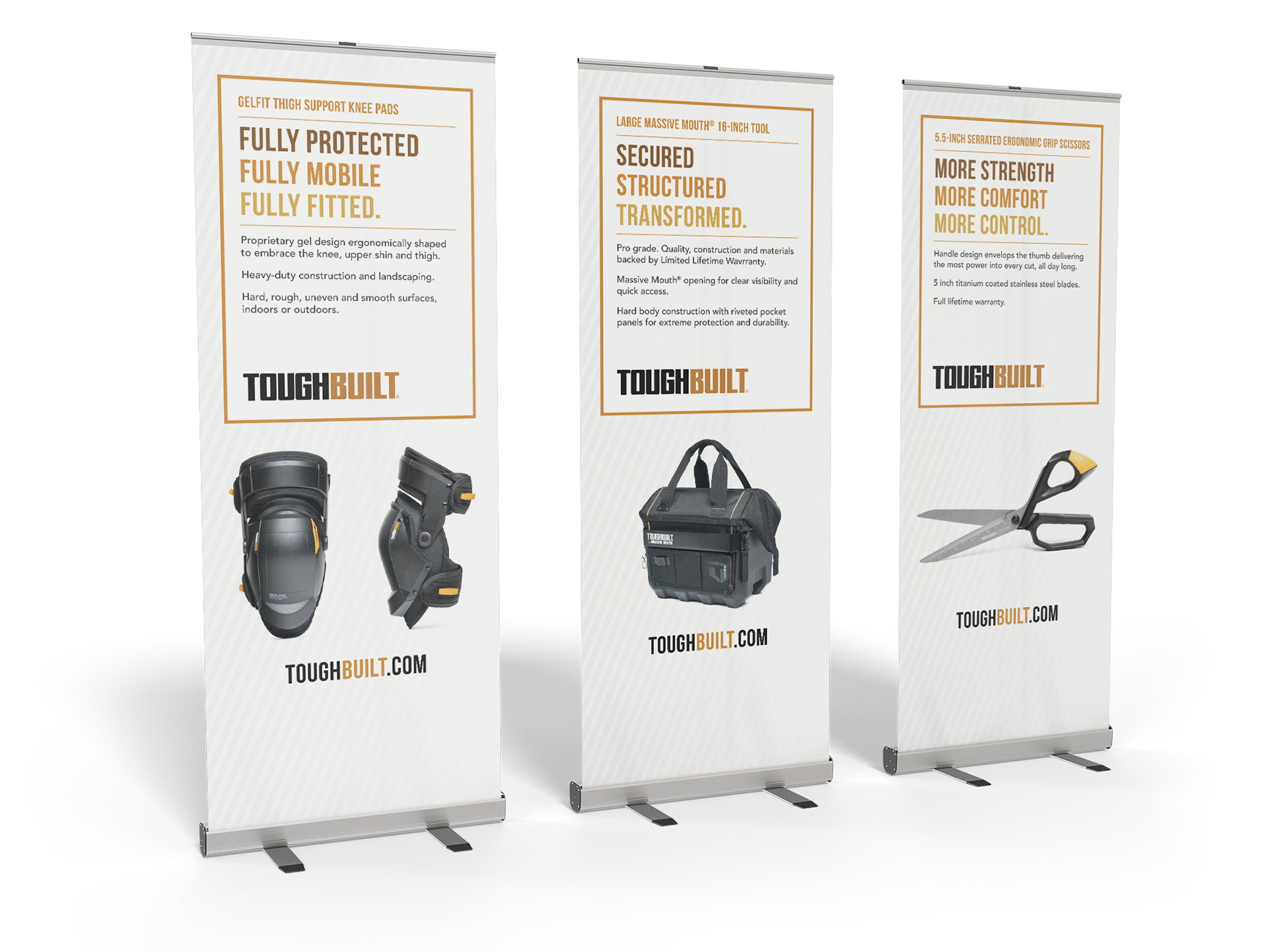
Pull up banners
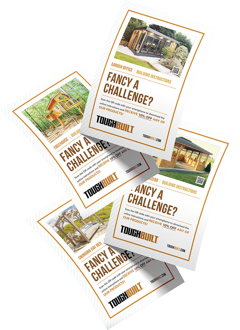
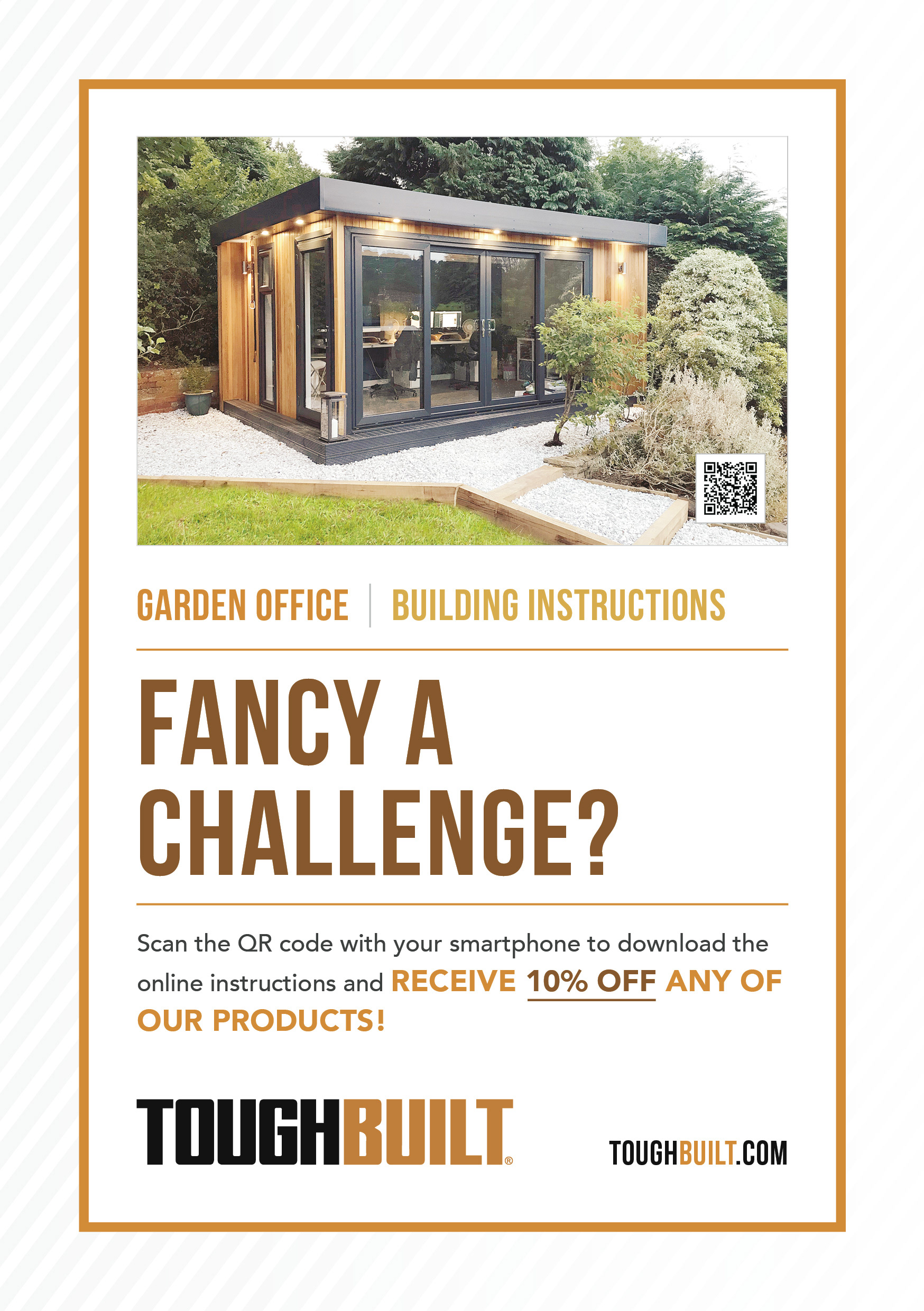
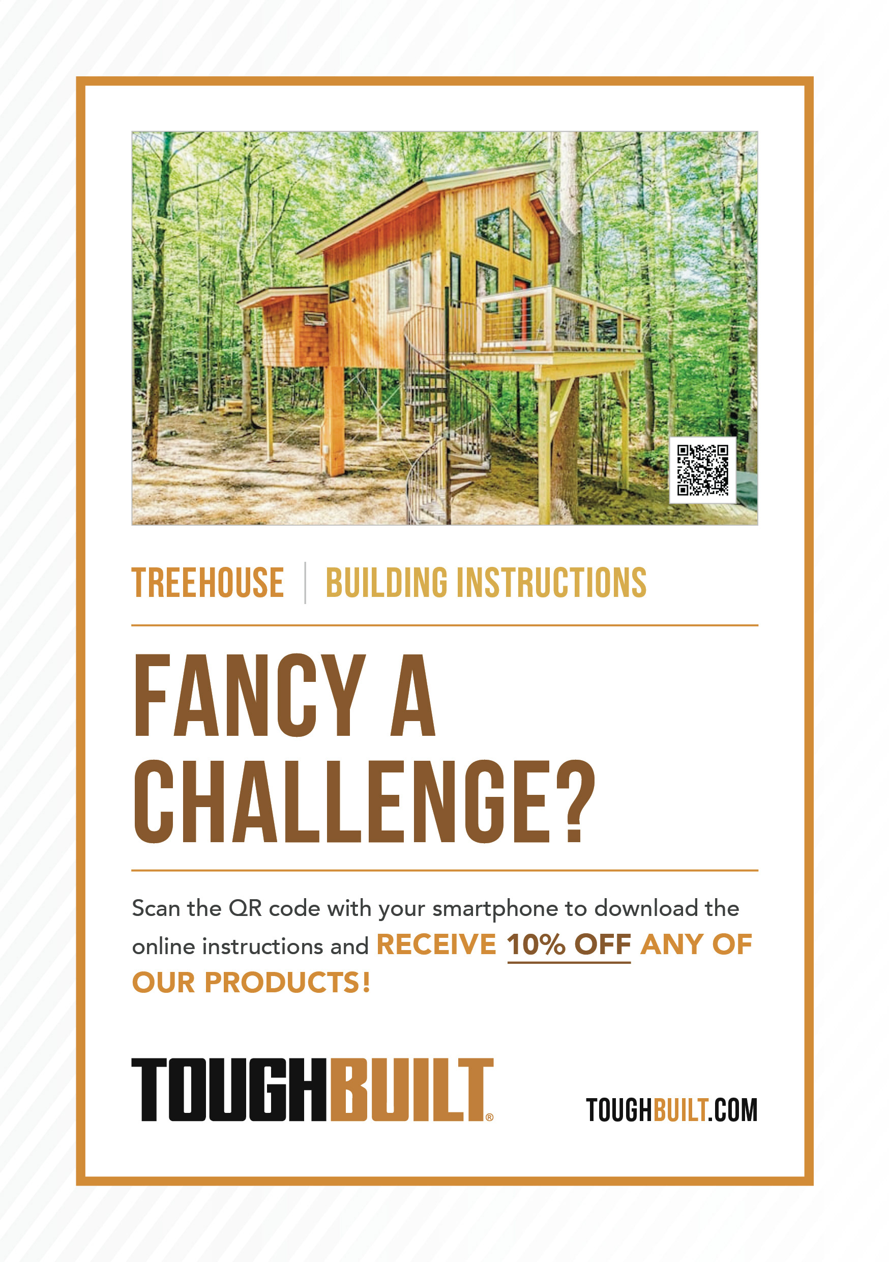
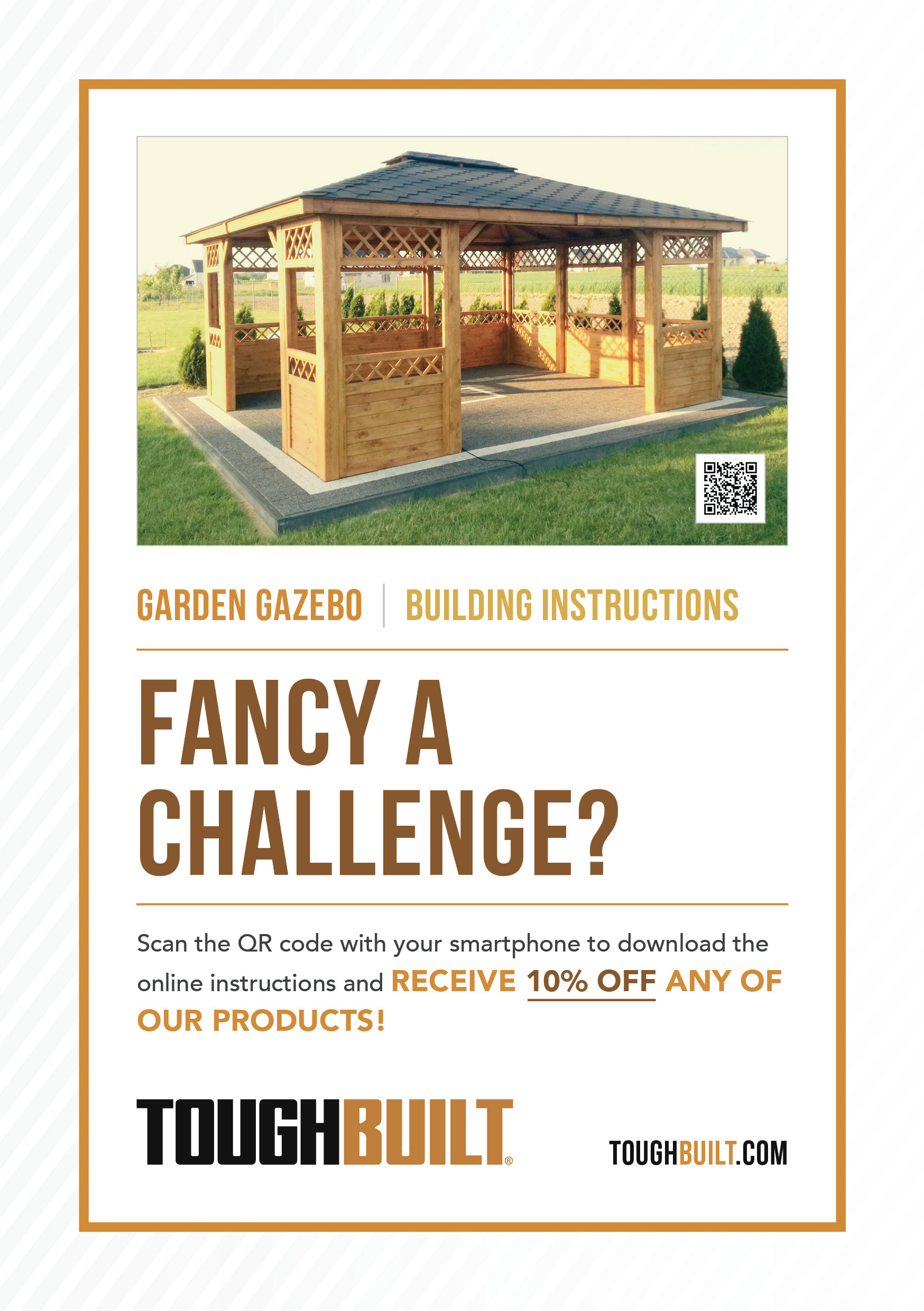
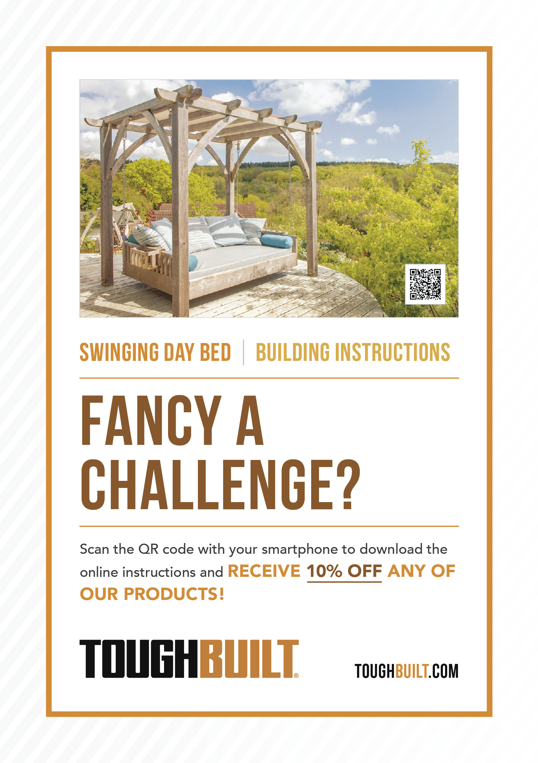
Flyers
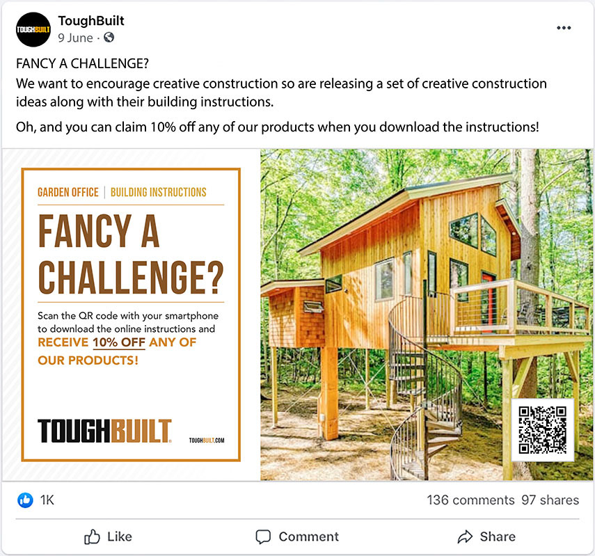
Facebook post
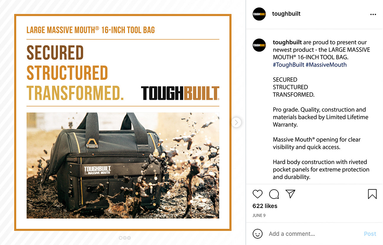
Instagram post