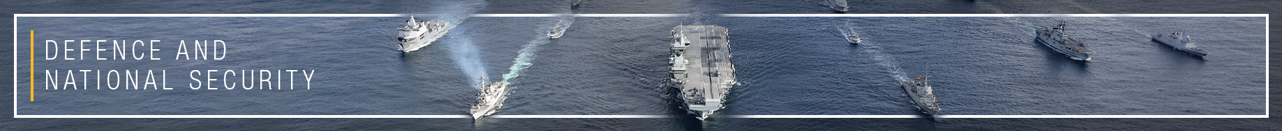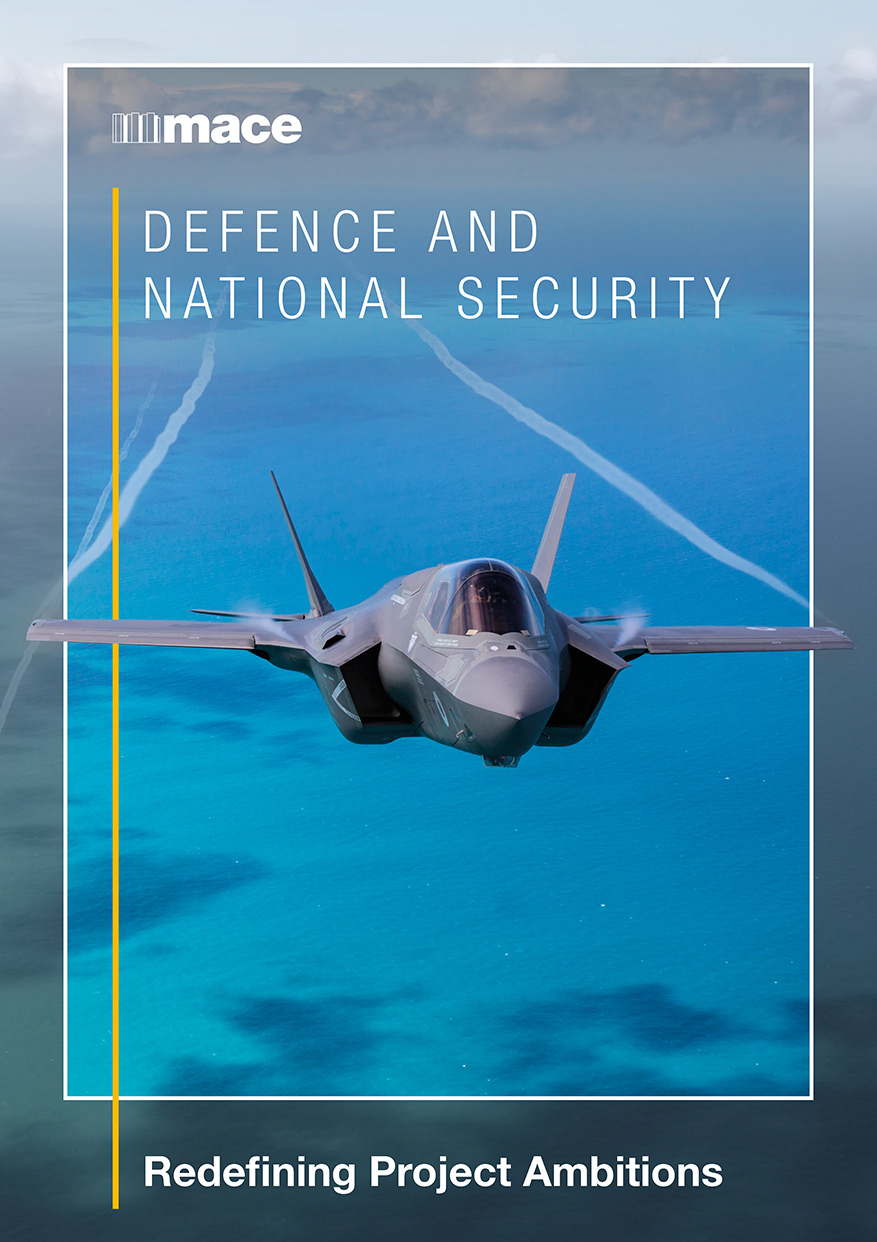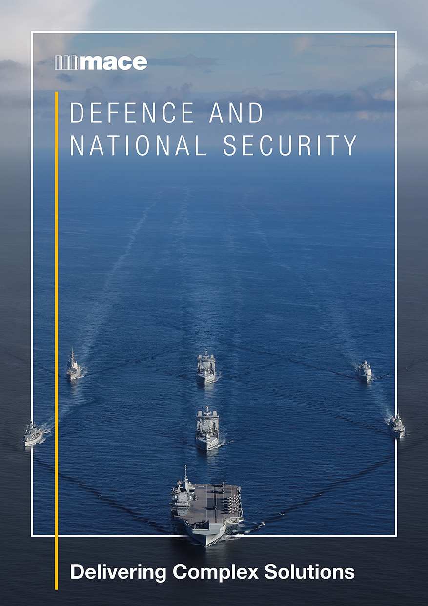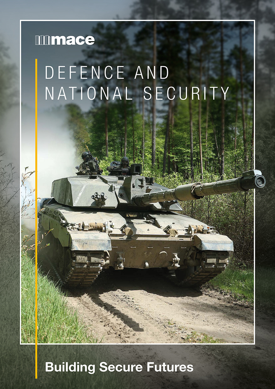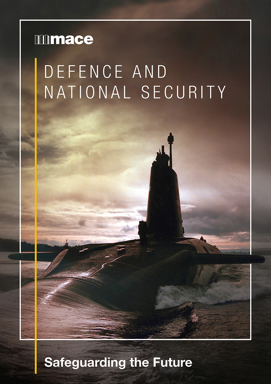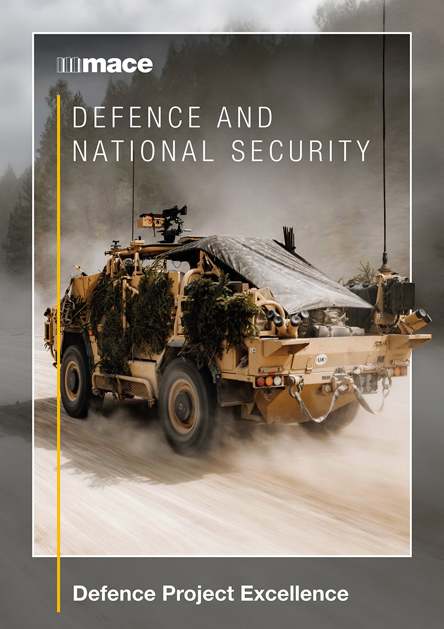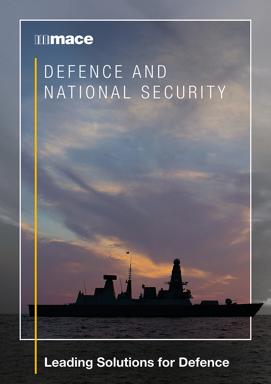
While working within Mace’s Defence & National Security business unit (BU), I was tasked with creating a poster series to promote the BU and establish a strong, recognisable visual identity. The aim was to communicate the unit’s values and offerings in a way that was both visually compelling and aligned with Mace’s brand.
I began by sourcing and adapting photographic imagery that reflected the BU’s focus areas, ensuring each visual was on-brand while introducing a fresh and modern aesthetic. The posters were designed for use across multiple platforms, including print, digital screens, and internal communications, maximising visibility and engagement.
To support the visuals, I developed a series of straplines that distilled the BU’s core aims into concise, impactful messaging. These lines were crafted to resonate with both internal stakeholders and external audiences, reinforcing the BU’s strategic positioning.
The design process involved using Adobe Photoshop and InDesign to build each piece from the ground up. I focused on clarity, consistency, and visual hierarchy to ensure the messaging was easily digestible and attention-grabbing.
The final artwork was very well received across the business unit and wider organisation. Stakeholders praised the series for its professional execution, strong brand alignment, and ability to elevate the BU’s presence within Mace. The posters helped foster a clearer understanding of the BU’s role and contributed to a more unified internal identity.